Graphs!


Source material: UMW grade distribution reports 2022 – 2023.
Story
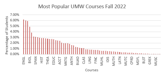
I was curious to find out which courses at UMW were taken by the most students over the past two semesters. Looking at the data I compiled, the top three most popular courses were psychology, English, computer science. This made sense to me, because although I don’t know many students with majors in these areas, I know many people taking classes that fall into these categories to fulfil general education requirements or to pursue a minor.
Process
This was my first time using Excel to create tables and charts, so I did a lot of experimenting, and I messed things up pretty frequently. I went through a couple of ideas that didn’t quite work out before I landed on this one. I used the percentage of students instead of the total number because there was a different total number of students each semester. I excluded classes that had no students, and all FSEM courses, because I wanted to look at classes that were chosen by students, and FSEM courses are required. I don’t like how the data is displayed, because it excludes some courses in between the ones that are labelled on the graph, so you can’t see what all the data represents. I couldn’t figure out how to narrow down my data any more or change the graph so that this was fixed.

